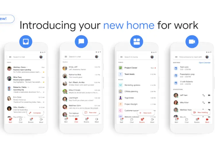
Google is implementing a new design across its Workspace apps to ensure a consistent look and feel. So far, Google has updated the interfaces of Google Drive, Docs, Sheets, Slides, and Gmail, and the latest app to receive the makeover is Google Chat.
According to the company, Google Chat will be given a new look based on Google’s Material Design 3 system. This will include changes to fonts, colors, layouts, panel sizing, and more. Specific areas that will be updated include the top app bar, left navigation, main message view, compose setup, new topic button, and the thread panel within direct messages and spaces. A preview GIF shared by Google shows a rounded search bar and additional sidebar options.

Google hopes that this modernized product experience will enhance collaboration and make task completion easier within workflows. The new interface will be rolled out to admins and end users automatically over the next several weeks and will be available to users with personal Google Accounts, all Google Workspace customers, as well as legacy G Suite Basic and Business customers.
In addition to the design changes, Google announced the discontinuation of Currents. The company plans to focus on community experiences that are better integrated with Google Workspace, and customers can choose to have their Currents data migrated to spaces in Google Chat. Starting from July 5, 2023, Currents will no longer be available, and Google will continue to invest in new features for Google Chat.


